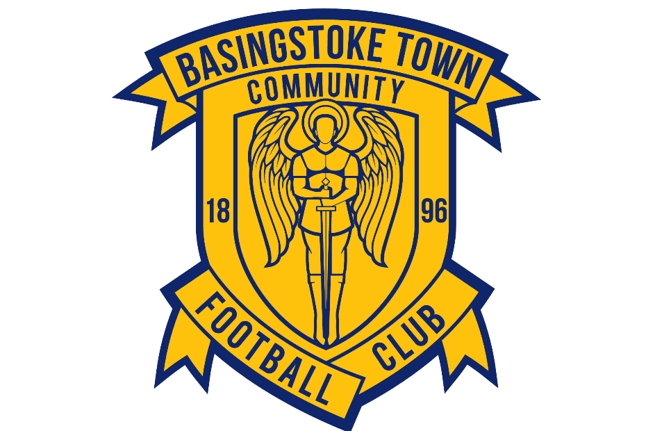
Introducing Basingstoke Town Community Football Club’s new badge.
As the club as a whole continues to grow, we want to be seen as a modern, forward thinking, progressive football club who respects it’s history but is ready to be taken to the next generation.
This evolution of the badge moves St Michael, the warrior archangel, to the forefront, gaining more prominence and clarity inside the familiar Basingstoke shield and ribbon silhouette. The name of the club is now more immediately apparent and, 1896, the year we were founded, has been added.
The previous badge was noted as having several inconsistencies and there were several iterations of it. The complication of the centre of the badge was an issue as it became increasingly difficult to replicate it accurately and this modernisation allows us to have a consistent, well-defined image which the club can use for years to come.
Chairman Jack Miller added “Supporters will know that this badge refresh has been a long time coming and it’s fantastic that we’re finally able to launch it and the end product is one that we’re immensely proud of. The Community Club Members and fans had their say all the way through the process and that was key for us – we’re a fan-run club and we wanted a crest that represented us all. There were some elements of the badge that were removed to make the badge clearer and easier to print both on merchandise and digitally, such as the Latin motto, but keep an eye out the imminent kit launch for how this has been incorporated.”
Through the stages of design, Community Club Members and fans alike were given a survey which determined that they were open to a badge update and then they were able to select which elements of the badge they’d ideally like to be retained. Those who chose to, then joined the club in listening and discussion sessions which lead the inspiration behind the concepts designs, provided voluntarily to the club by Ric Dennis of Hope + Glory. The two final designs were then put to a Members poll with the more familiar design being chosen.
We now embark on a transition period, updating the badge to the new one and we appreciate your patience on this over the next few weeks.
We’d like to thank all those involved for their input and honest feedback, especially Steve Frangou, Dom Lane and Mark Oram and to Ric Dennis of Hope + Glory for his fantastic work in designing our new badge, having had experience in this field including creating a Football League club’s badge, and also to Dan Lintern for his great efforts on the launch video.
—
History of the badge: Basingstoke Town FC have had several iterations of badges through the generations, from having ‘BTFC’ diagonally stitched in to the shirts to the shield shape we know today. The top banner was added when the club joined The Southern League and ‘Southern League’ was later replaced by ‘Camrose’ and then ‘Community’ in 2017. The shield badge has had a football in the middle of it during the late 80’s and early 90’s and subsequently also St Michael slaying a dragon inside the ball before the ball was removed and now the dragon. St Michael is an archangel ‘warrior for good’ and protector of heaven in his triumph against the devil (sometimes depicted in art as a dragon or a serpent). St Michael is prominent in Basingstoke – being present on the current Basingstoke Town FC badge, on the Basingstoke Coat of Arms and before the town even had a coat of arms on the ancient seal of the former Borough of Basingstoke (circa 1392), and subsequently in the names of St Michael’s Road, St Michael’s Retail Park, St Michael’s Hospice and of course St Michael’s Church – the oldest church in Basingstoke (500+ years old).

